Food & Beverage (F&B) is one of the largest industries in the world. The increasing globalisation is helping new cuisines and restaurant ideas to arrive in the lucrative food markets of India. In an article on the CBRE Group website, it was mentioned that in India 82% of the restaurants are locally owned businesses and only 18% of them are International food brands. The statistics suggest that locals are intimately comprehending the flavour of consumers. But it is not just the recipe that runs a restaurant. The interior of the restaurant, hospitality and branding plays a significant role in building a fulfilled consumer experience. The more the restaurant is attractive, the more unique experience it can provide to its visitors. And most importantly with plethora of options around you, gaining a ‘walk-in’ is the biggest challenge.
Approaching Sign as a landmark
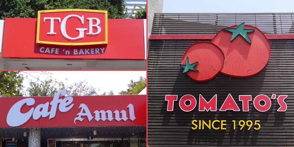
Sign Board plays a vital role in shaping the brand identity of a restaurant and creating a perception among its target audience. For example, when Elite Signs was delegated with the project of creating a substantial red chilly for the Mirch Masala restaurant, we made sure to give it an extremely picturesque setting with full of animations. The texture of the red LEDs used in the Mirchi Emblem (Chilly) is exceptionally eye-catchy from a distance and indicates the savoury taste of the cuisine served there. The blinking Mirchi hoarding has now become a brand identity of Mirch Masala, and its enormous size showcases the scale of the almost 30-year-old restaurant chain. Such a sign gives an added advantage of turning your space into a landmark. Similar feat is achieved for Tomato’s diner and many other popular eating out options

The Functional approach to Sign
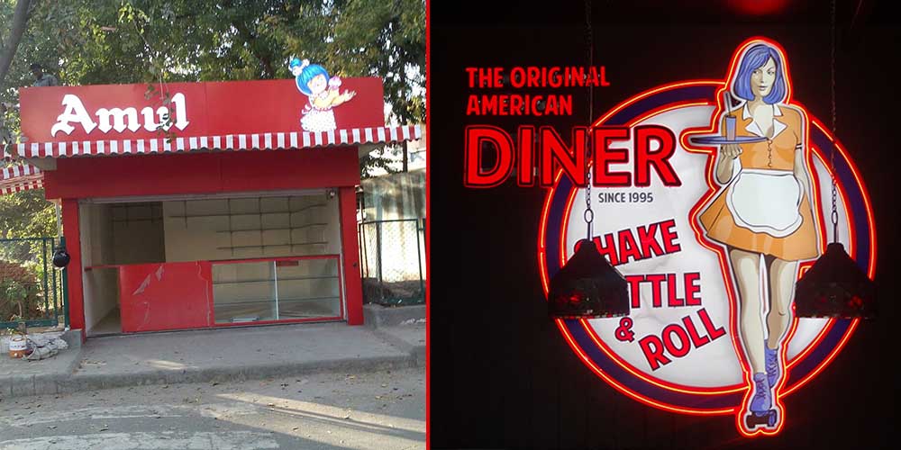
When Elite Signs was asked to create a sign board for the Amul kiosk, which is like a retail outlet of one of the largest Milk brand in the world, we used a different strategy. These kiosks are placed outside the public parks in Ahmedabad. We mindfully studied the brand, its trustworthiness amongst customers and conveyed it through boldness. A bold red composite panel background with Face Glow letters were the chosen medium. This ensures same boldness during daylight as well as during night. The key function of the sign being to showcase its presence, it is well achieved by this straightforward approach
F&B demands an arty approach when it comes to indoor applications. For example when we were asked to create illuminated signs of a waitress for Tomato’s, we made sure that it should moreover look like a poster instead of a billboard. Even today when you enter the restaurant and watch the banner of the skating waitress bringing a beverage on a tray, the design will automatically teleport you to the America of the 80s, which is the diner’s theme.

Translating the logo in the large format application
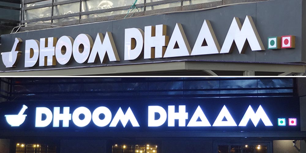
One of big mistake which many sign makers do, is to not giving attention to the large format translation. The logos are created primarily for smaller applications of print media; but when the same has to be applied in massive scale and in 3d sphere, a lot of care needs to be taken. Let us take the case of ‘Dhoom Dhaam’ a fine-dine restaurant located in the uptown vicinity of Ahmedabad. It has extremely bold font and the design is monochrome. In our process we ensured that the fonts were spaced adequately, making it a pleasing view to the eye. The typographically equidistant alphabets played a very significant role in shaping the Dhoom Dhaam logo. Also we kept the wall colour darker from the face colour (white) which ensured that the vision is not blurred for the viewer.
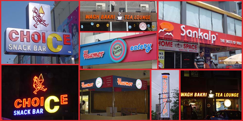
There are multiple variables that lead to the creation of a result oriented signage. Its application, its objective, understanding the brand, scaling up suitably – these and more have to be considered. For F & B outlets having a steady flow of walk-ins is imperative for survival. And a well thought signage can prove to be a valuable investment in the long run.


