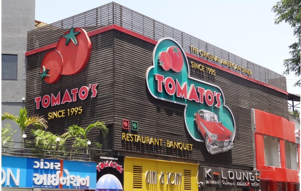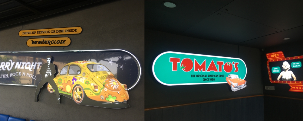
Ever since the early 90’s, when TOMATO’S brought in the diner concept to the city of Ahmedabad, we have had the privilege of doing their signs. Neon, Bright Lights, Glossy Graphics are an important part of an American Diner interiors. After 4 diners in Ahmedabad, 1 in neighbouring Vadodara, Tomato’s – a brain child of restaurateur Mr. Rushad Ginwala – has now opened its gates for patrons of Rajkot. We take pride in our association with Mr. Ginwala and are humbled by the faith he instils on us. The Rajkot diner has many special features, unique from its predecessors, and that made the role and responsibility of Signs & Graphics all the more important. www.tomatos.co.in

The Ambience of Tomato’s
First & Foremost the diner has a huge two sided facade; secondly Tomato’s in Rajkot is divided into three storeys, thirdly it houses a banquet and lastly it has an open air sit out – all of it to be accommodated in the same theme. The ambience designer, Arundeep, had a vision of making the ‘graphics come alive’. He wasn’t looking at static & boxed stuff. He created some amazing graphics using visuals from American pop-culture and created varied shapes to fill the entire space. Once the designs came to us, we were in complete awe of the material on hand. Our job was now to specify and create layers out of the design. We took it design-by-design and looked at the three aspects of – material selection, layers & shapes and illumination – to make these lovely designs come alive.
Mixed Media Approach
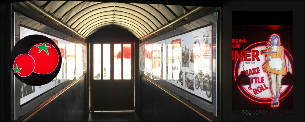
Early on in the project we decided to not look at these project as a ‘sign’ project, but more as an design installation project. This changed our approach and we started generating ideas, of mixing materials, that is normally never done in indoor signs. For example we mixed Gloss finish Gold sheet, with acrylic and Decal applications and fitted LED’s to make make it look like a 3 dimensional illuminated art piece. It created depth, brightness and a visual quality that is very attractive for the viewer. Or take the case of the ‘Waitress Sign’ (7.5 ft wide) where Decals, Acrylic, Layering’s, Led and Neon – all is fused to create a stunning imagery, a visual impossible to ‘not look at’.
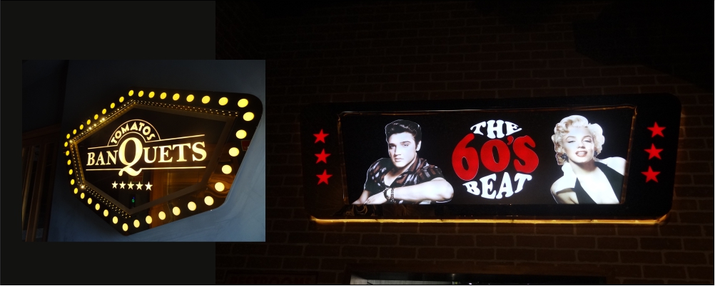
The designs had a lot of cut out posters, each distinct from the other. Be it the Marlyn Monroe poster or the Laurel & Hardy graphic each had bright tones and shapes that were to be maintained. All of this was first printed on high quality vinyls and applied on MDF sheets. It was then put through the process of cutting using a router and voila we had these amazing designs out. But it didn’t end here ! At the site, it was important that these graphics and characters speak with the viewer, and so the decision to install each with raisers. None of the graphic is flushed to the wall, and this creates great play of light and shadow that entices the viewer. It looks so beautiful !
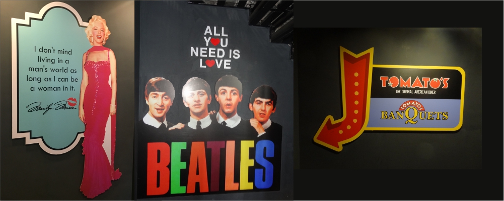
An American Diner concept relies heavily on pop visuals. The magic quotient of the environment depends on the ambience and effectiveness of graphics. Once inside, the guest should be instantly transported to a new realm. Exposed Neon and colourful prints are the two mandatory materials that are to be used. Across all Tomato’s we have merged these two core materials, but here in Rajkot project we went a few steps ahead and re-imagined the role of signs and looked at it as a design installation project. The designers & promoters vision of seeing the graphics ‘come alive’ is successfully achieved and we are glad that the magic of Signs by Elite Signs team is adding to the dazzle of the premium diner.

