Less is more, that seems to be the latest motto of the designing industry. From architecture to modern art, simple and clean typefaces are a trending concept which allures the viewers most. And why wouldn’t it? It is visually appealing and gives an elegant vibe to whatever it is associated with.
Simplicity in Sign Design basically is the practise of using minimum number of elements and lesser volume of material to convey the message. While, the idea is simple, the impact is game-changing. Through numerous researches it has been extrapolated that simplistic looking designs appeal higher to the discerning and educated consumer markets.
At Elite Signs we have crafted many such Signages that have an influencing appeal. Amidst the clutter of retail outlets, on highstreet or in a Mall your eyes will catch those outlets that have a unique signage and can express their personality quite well. Good designers understand that conveying your idea with little to no words can be more powerful than a cluttered sign. They understand that they have a fraction of a moment to get your customers hooked which lures them into your store. Here are few of the project we would like to talk about.
The bold & beautiful signage of Shades of Blackk Spalon
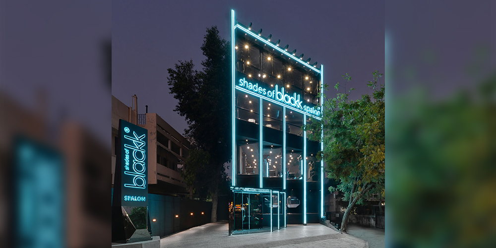
Image Credit: Shades of Blackk Spalon
While the buildings stunning architecture is captivating the clients design team placed the Channel Letters in such a way that they become a striking element of the facade. In the day, white coloured Acrylic Sides Channel Letter Sign pops out from the seeming black canvas of the building, but by night the signage shines with the blue LED. The blue light washed in White acrylic creates a soft but bold illumination.
The inviting sign of Travelers Home
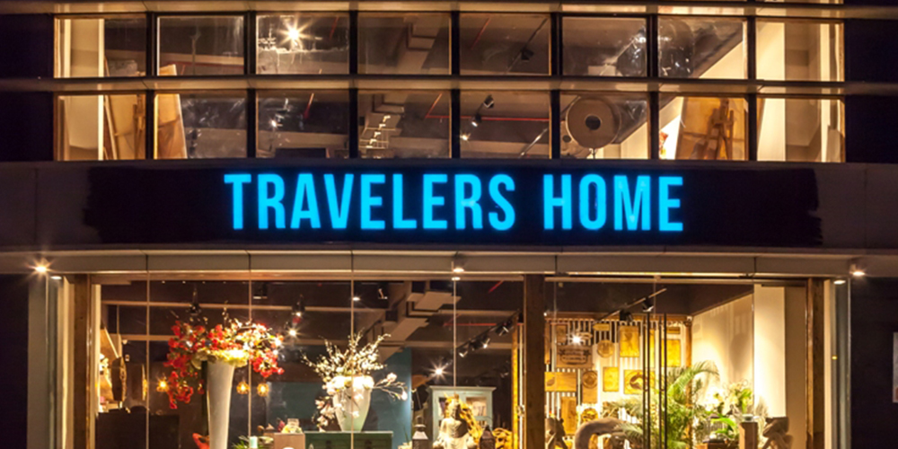
Image Credit: Travelers Home
A store known for designer and artistic merchandise, surely can’t go loud on its exterior; yet it has to stay attractive amidst the noise around it. In comparison to other retail signs this particular signage is visible from a fairly long distance. Sitting quaintly on the corner of the intersection that connects two very busy roads the Traveller home sign uses the typeface to it full advantage. Plain and simple letters made in Acrylic Side Channel letter type are illuminated using white LED’s, which create a lovely turquoise glow. The face of white Acrylic letters has vinyl facia on it, to match to the client’s logo tone. The installation is such that it sits beautifully on the well crafted exterior and doesn’t poke out as a sore, but stands out and creates an identity for the store.
The stylish corporate look of Shivalik Abaise
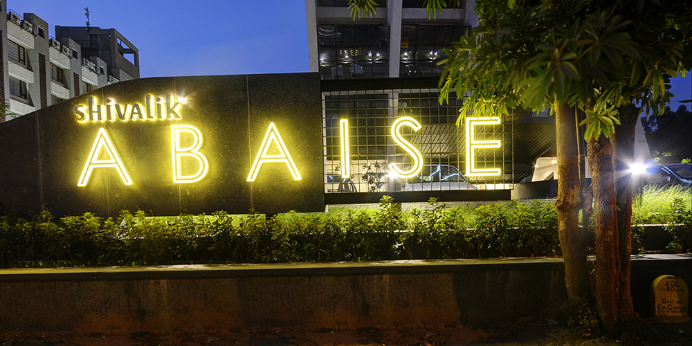
Image Credit: Shivalik Abaise
Shivalik is among the reputed real estate developers of the region. Abaise is one of their early project. It is exquisitely designed and a special team worked on the signage design. Once the concepts were shared with us, we put all our ideas together and created this unique Custom Design Signage that beautifully fuses metal and acrylic to create a stunning play of light and shadow. At the outset it looks like simple plain typeface, but the way each letter is crafted and its unique installation needs, sets this sign apart. It is a lovely example of how through high quality letter fabrication and installation excellence a simple looking signage can be enhanced.
Simplicity is en vogue and at Elite Signs, we have a plethora of ways to add life to your imagination.